Controversial I’m Worried About Xebec’s Color Scheme
- Thread starter EmperorKinyagi
- Start date
More options
Who Replied?
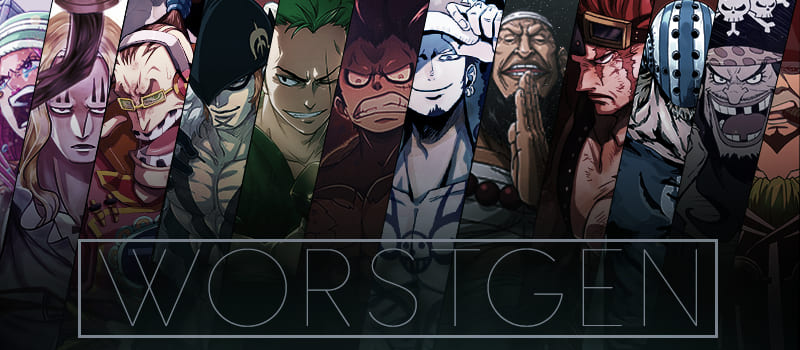
Does Blue Pheasant have blue hair?
Does Yellow Monkey have yellow hair?
Does Red Dog have red hair?
Does Wisteria Tiger have purple hair?
[automerge]1761233827[/automerge]
Final cover is out.
It’s slightly better yeah, but Killingham still looks HORRENDOUS with that yellow… even his eyes are yellow wtf
:shame:

It’s slightly better yeah, but Killingham still looks HORRENDOUS with that yellow… even his eyes are yellow wtf
:shame:

Sooooo..... does oda even care any more? I mean he obviously doesnt care about the coloring. He has turned every single character into a clown(no surprise that he worshipps buggy that much). He didnt care when Toei turned one piece into a dragonball spin off. He doesnt even care about ending the story when he had already stated multiple times that one piece took him longer than expected and has been hospitalised due to over exhaustion before. Taking every single year more and more breaks to the point that 3 chapters per month is considered an anomaly. So yes you should be worried. i personally wouldnt be surprised at all if i saw xebec with pink hair and blue skin.


