- Status
- Not open for further replies.
More options
Who Replied?
D
Aye, I missed the neon green things. That is a bit weird for Mihawk.
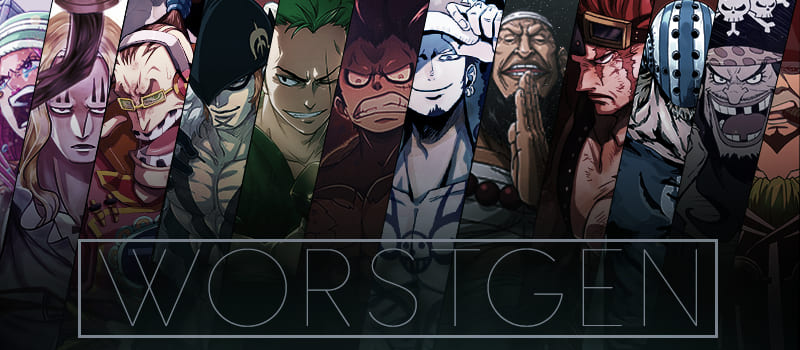
I really hope the Zoro theme is left alone. It already went through a necessary redesign (back when the theme had zero Zoro and too much random arse Feudal Japanese samurai in the background) and it is still the least colourful character theme.
I really hope the Zoro theme is left alone. It already went through a necessary redesign (back when the theme had zero Zoro and too much random arse Feudal Japanese samurai in the background) and it is still the least colourful character theme.
B
For Version 1.0 it’s better than anything I could’ve done, now you just need to patch the bugs
First get rid of the neon green

First get rid of the neon green

D
Well consider that the end result may vary from use to user ( quality of the display / settings) I've tried it on multiple displays and indeed on some of them looks a little neonish while on others it looks even saturated so I took something in the middle ( for example i see everything pretty much fine on my monitor )

- Status
- Not open for further replies.


