When I'm talking about proportions, I'm saying the eyes for older one piece character designs were much bigger than they are now.
As opposed to just blabbering on, here is the evidence.
One Piece had one main character designer in Noboru Koizumi up until Thriller Bark, however, there were episodes and scenes where different animators such as Naoki Tate would step in to create their own designs.
Here is Noboru Koizumi's Luffy.
This one wasn't Koiumi I don't think, but it serves my broader point as well.
In the earlier eras of One Piece, characters had really lanky arms, as well as disproportionately largely defined hands and feet, as well as incredibly expressive eyes.
Just wanted to include some more expression sheets. Not sure if these were Noboru Koizumi or Katsumi Ishizuka. Katsumi Ishizuka very heavily referenced Noboru Koizumi's artstyle.
This shifted when Kazuya Hisada became chaaracter designer.
Hisada's character designs have smaller eyes, and more proportinate hands and feet. I'd argue that perhaps he makes Luffy's face a bit longer as well.
I'll be the first to say that I'm not a terribly big fan of Hisada's LUffy, especially later on, but if your quantifying it terms of cartooniness, than the newer designs are less cartoony. While Oda's older stuff had disproportionately large hands and feet, the anime has evolved with Oda to make his hands and feet more proportionate. Oda's artwork used to be filled with more round shapes, which has been replaced with sharper more straight line work.
The anime has followed this pattern.
Thee character designer for Wano is Midori Matsuda, and their designs are also heavily referenced from the manga to be as close to Oda's as possible.
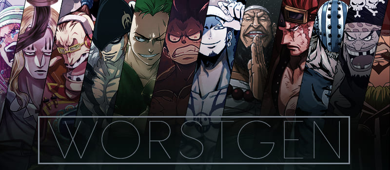
Even guys like Crocdile and Katakuri have pretty exaggerated designs. Their proportions just go on focusing on making them having something like really long legs(this was something noted for Katakuri in particular).
As for the cartoony appeal of the series, I mean more stylistic things. I actually miss how Oda used to draw hands and feet rather cartoonishly big. They made the characters very expressive.
Yeah, its grown to be more serious(again, shift from Oda using rounder shapes to more realistic ones), but its also lost a lot of the charm that made it interesting in the first place.
My point is, the anime looks like Oda's work currently. You can't say the anime has grown more childish artstyle wise while the manga has grown more serious because the anime is intent on copying Oda's current artstyle.