Controversial I’m Worried About Xebec’s Color Scheme
- Thread starter EmperorKinyagi
- Start date
More options
Who Replied?Sommers is a ginger @TheAncientCenturion
Guys Lolda covered up Gunko’s panties in this volume spread. That means that we can expect in the next SBS after this one a question about what Gunko’s panty colors are 
@ZenZu @EmperorKinyagi @Monster Zoro's Tesla Supplier

@ZenZu @EmperorKinyagi @Monster Zoro's Tesla Supplier
Guys Lolda covered up Gunko’s panties in this volume spread. That means that we can expect in the next SBS after this one a question about what Gunko’s panty colors are 
@ZenZu @EmperorKinyagi @Monster Zoro's Tesla Supplier

@ZenZu @EmperorKinyagi @Monster Zoro's Tesla Supplier

Final cover is out.
It’s slightly better yeah, but Killingham still looks HORRENDOUS with that yellow… even his eyes are yellow wtf


It’s slightly better yeah, but Killingham still looks HORRENDOUS with that yellow… even his eyes are yellow wtf


The only time I take colour seriously is in high budget One Piece films. The staff really cares for those little details in movies.
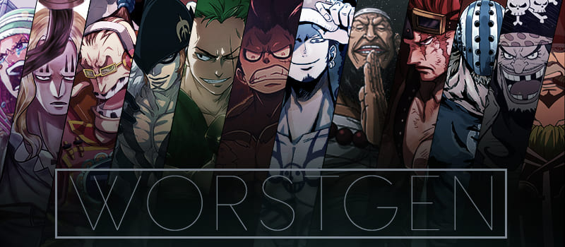
It will probably look like ass what with how Loki, Garling and some other recent ones turned out, but considering the color schemes the Holy Knights received in volume 113, I'm having some hope it will be good, even if Killingham looks like the corny mascot from those old cheese wheel commercials from the 60s and Sommers is wearing purple for some unholy reason. Still hoping Xebec's hair will be black and white at least.
Final cover is out.
It’s slightly better yeah, but Killingham still looks HORRENDOUS with that yellow… even his eyes are yellow wtf

It’s slightly better yeah, but Killingham still looks HORRENDOUS with that yellow… even his eyes are yellow wtf

Agreed, people need to chill.
There's even series where the author deliberately draws characters with different hair colors on each cover.
People need to let go of the idea of ''canon coloring'' as it's still a b/w manga they're reading and this will never change.
Oda is lazy when it comes to coloring and near exclusively uses the same skin tone for every character
you guys gotta stop taking these volume cover colours seriously, Oda just uses the colour which is convenient to him at that time, Killingham's eyes are obviously not the exact same colour as his hair, Oda just couldn't be bothered to take out another colour...he's done this multiple times. I mean King was not even dark brown in the volume cover, he was the same skin tone as Zoro. Doesn't mean anything.
The only time I take colour seriously is in high budget One Piece films. The staff really cares for those little details in movies.
The only time I take colour seriously is in high budget One Piece films. The staff really cares for those little details in movies.


