The two biggest complaints I’ve seen vis-à-vis Imu’s design are that firstly, it doesn’t fit with the the formal corporate/regal look of the Gorosei and the God’s Knight. Imu looks more like a criminal than the leader of the only institution providing order on the blue planet. But what critics fail to realize is that their complaint is literally Oda’s point. Despite all the high minded language the Celestial Dragons use, no matter how beautiful their outward forms are, no matter how much honorifics they put in front of their name, in reality they are far more base than any pirate and are infact the fountainhead from which all other villainy in the world stems from. I’m not trying to say Oda is breaking new ground and pushing the medium of manga to its limit or anything like that. It’s just that this is a pretty basic theme that most readers should get after a cursory reading.
 Sabo even spells it out when attacks the Goresei. If you think of Imu as the boss of the diplomatic suit wearing Gorosei who deal with Akainu and Clover, this design seems out of place. However that version of the Gorosei has always been a mask for the most grotesque creatures in the One Piece World. If you think of Imu as the master of the odd Yokai forms we saw in egghead then it makes sense.
 The second criticism is that Imu doesn’t look like a One Piece character. He looks as though he has been transported from another edgier manga into the colorful world of One Piece. This once again is intentional. Gaban, someone who is atleast partially privy to Imu’s past, even explicitly makes note of it in their first encounter.


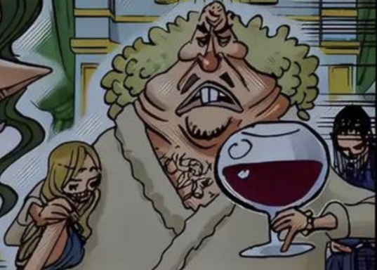
 Blobmu is best mu
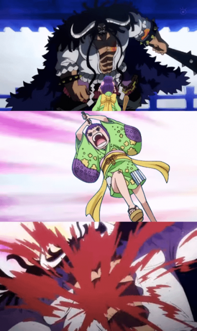
 After so many Characters there isnt much Left..there were „Pretty“ ones Like lucci or Eneru and Not so Pretty more Monster Like ones Like Kaidou or magellan