Best Character Design FINALE
- Thread starter Light D Lamperouge
- Start date
More options
Who Replied?
I voted for Jotaro last round.
Mihawk takes the cake for me here though, his design is very clean, a reflection of his personality and fighting style (to cut cleanly and efficiently). It's very tide, everything is clean, sharp, and symmetrical. In a verse where everyone looks like they havent showered in years, Mihawk looks like he smells like expensive cologne.
Oda has some of the most expressive character designs, with one glance you can tell what type of personality, or what kind of fighter a character is.
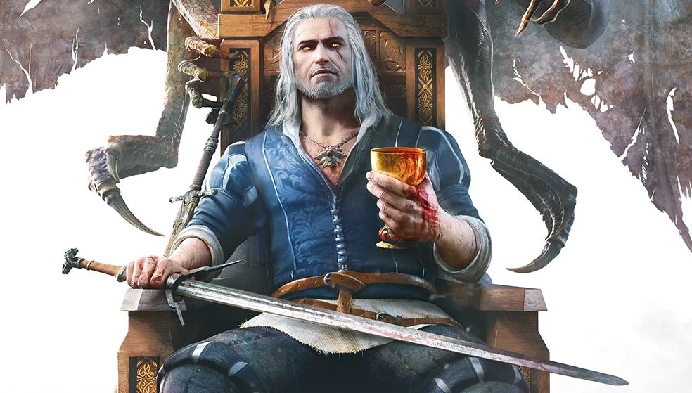
Geralt is great but his getup doesn't stand out much from other witchers tbh. It's not really popping.
Guts is also great, but I prefer Mihawk's colour scheme. It's hard to miss when he's on screen compared to Guts who blends in more with the background.

But look at this:

It think he stands out fairly well as there are multiple schools of witchers, not many from the school of the wolf which is what his design is about.
[automerge]1634766634[/automerge]
Damn guts took a huge lead.
One cannot deny the fact how the design of Guts constantly changed throughout the story by him struggling with many people's and getting them scars (every scar has history behind it) and loosing his arm. That's one of the main reason why I'm repping for him to win and I haven't played or watched the witcher so I ain't voting Geralt


