Controversial What the hell happened to the art in the manga? (Chapter 1118 and beyond)
- Thread starter Rarted
- Start date
More options
Who Replied?
From what I’ve seen, no. Vagabond, Slam Dunk, Rurouni Kenshin, DBZ, Naruto, Death Note, Bleach, Blade of the Immortal are all better than OP in art (although OP have had great art as well, especially in Water 7/Enies Lobby). But what little I’ve seen from JJK is utter crap, sorry.
I thought his eye surgery was going to help with that
It makes me think of a comic book artist, Erik Larsen, creator of Savage Dragon (a creator-owned comic book, that he's been running alone since like 1992, so kind of similar to Oda and OP). His art went from clean and bombastic to rough and cartoony over the years, and he got the same criticism as Oda. The difference is he actually talked about it, at length. And without hypocrisy, unlike Oda I think, who is now tied to a huge franchise and his editors.
Larsen acknowledges the roughness and change of style. He thinks his art got better, not worse. He says he could go back to his old style in a heartbeat, and it's not time cutting or phoning it in (might be lying sure). He just likes it better this way. He sometimes even points out huge anatomy or perspective mistakes in his old, more popular work, and how he actually improved over time.
Since 1992, Savage Dragon has been a cop, a super hero, a wanderer, saved the multiverse, died, came back, died again for good, and now his son is the hero. The art style changed over time to follow these new directions, sometimes jarringly. Larsen never gave a fuck. Oda doesn't seem to neither.
Sometimes I wish Oda wasn't tied to the Jump grind, to Toei's and Netflix's billions, etc. These gave OP some of it charms, but took so much away, especially art wise.
Also, fun fact, I didn't like his style when I was a kid and stopped reading. My friend would love the story but absolutely hates the early art and can't keep reading. I got back into OP as an adult around 957 and loved the style. I still do. It's just as I caught up to the scans that I started to notice strange or unreadable panels. And it's often just bad scans and bad redraws. The volumes read 10 times better, except I'm old now and they're too small.


I'm surprised it took him this long to degrade to this level of rushing with the art. Togashi is an amazing artist, and some of his panels have been looking like they were drawn by ONE from OPM even back during Yu Yu Hakusho.
Just gotta accept that at some point it becomes more about the story than the details in the artwork.
Just gotta accept that at some point it becomes more about the story than the details in the artwork.
I think you guys are not understand that you can't draw a manga the same way when you think you have 5 years to f
I think you guys are not understand that you can't draw a manga the same way when you think you have 5 years to finish your story and when you know you will need 15 and might not even be able to finish it...
Oda's drawing are still amazing, he just got rid of the stiffness of his old style to adopt a more organic and optimal approach. Yes, Background character can be sloppy at times (on purpose), and his inking is slightly larger but as you can see here with Bonney, when it matters, the drawing is clear and gives EXACTLY the emotion that it needs to deliver.
So yes. Oda can still draw. No need to worry.
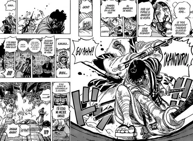
The current art feels like it could be from a completely different manga. The art has been at its absolute lowest ever since the latter half of the Wano arc. The linework is awful, it's hard to make out characters and their actions. The lightning-fast pacing of the current manga made full-double spreads become a rarity. There's less emphasis on important moments. Instead, they are tucked away in tiny panels for a single page. Don't give me the "but Oda has health issues" crap. Oda should stop using manga as a means to convey his story if drawing takes too much of an effort for him. Although that's pretty much what he's doing already - he puts more emphasis on written speech than the art.
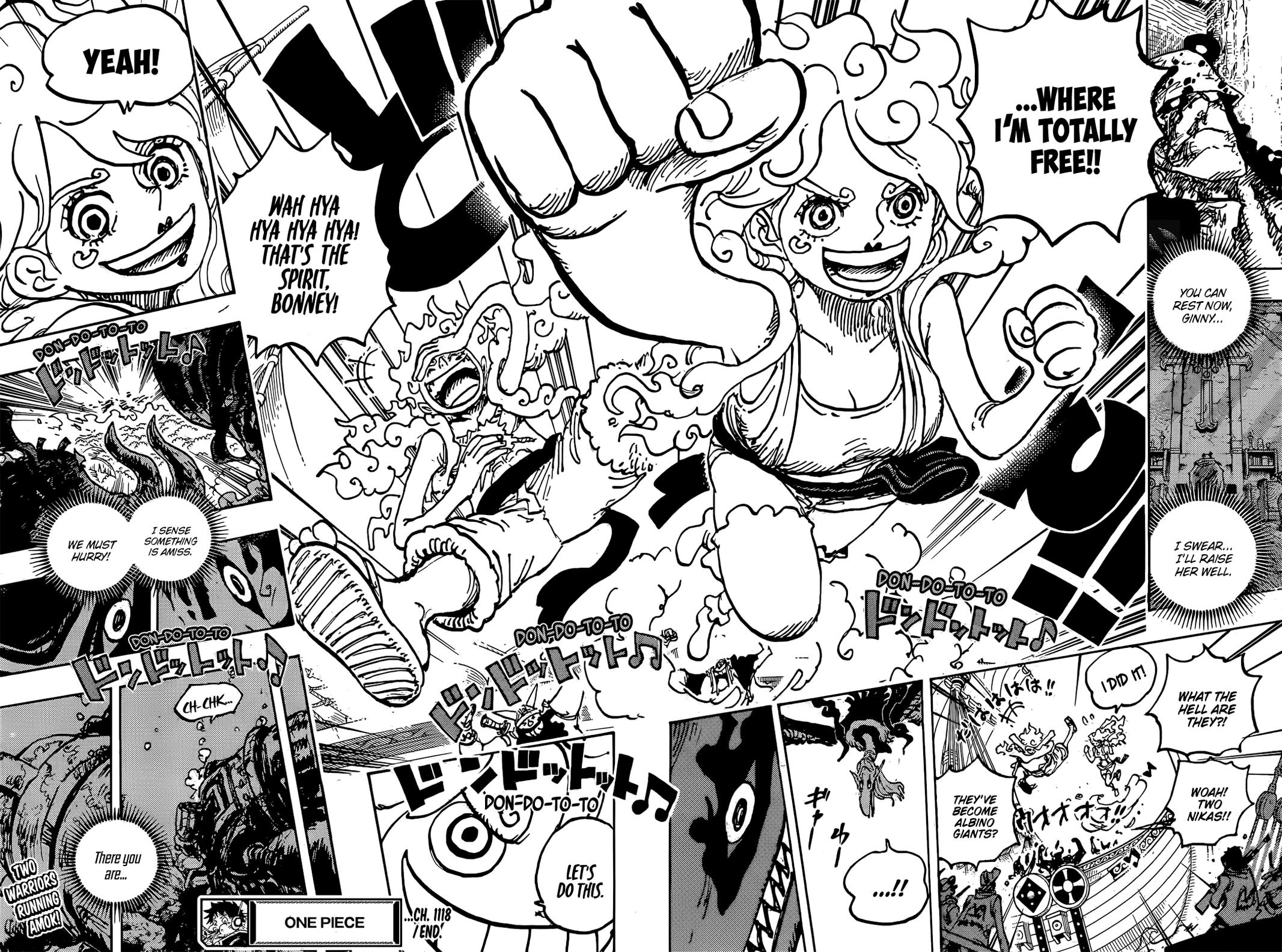
Oda's drawing are still amazing, he just got rid of the stiffness of his old style to adopt a more organic and optimal approach. Yes, Background character can be sloppy at times (on purpose), and his inking is slightly larger but as you can see here with Bonney, when it matters, the drawing is clear and gives EXACTLY the emotion that it needs to deliver.
So yes. Oda can still draw. No need to worry.


Oda's drawing are still amazing, he just got rid of the stiffness of his old style to adopt a more organic and optimal approach. Yes, Background character can be sloppy at times (on purpose), and his inking is slightly larger but as you can see here with Bonney, when it matters, the drawing is clear and gives EXACTLY the emotion that it needs to deliver.
You can't convince me that yours actually seeing anything in these new backgrounds
/)
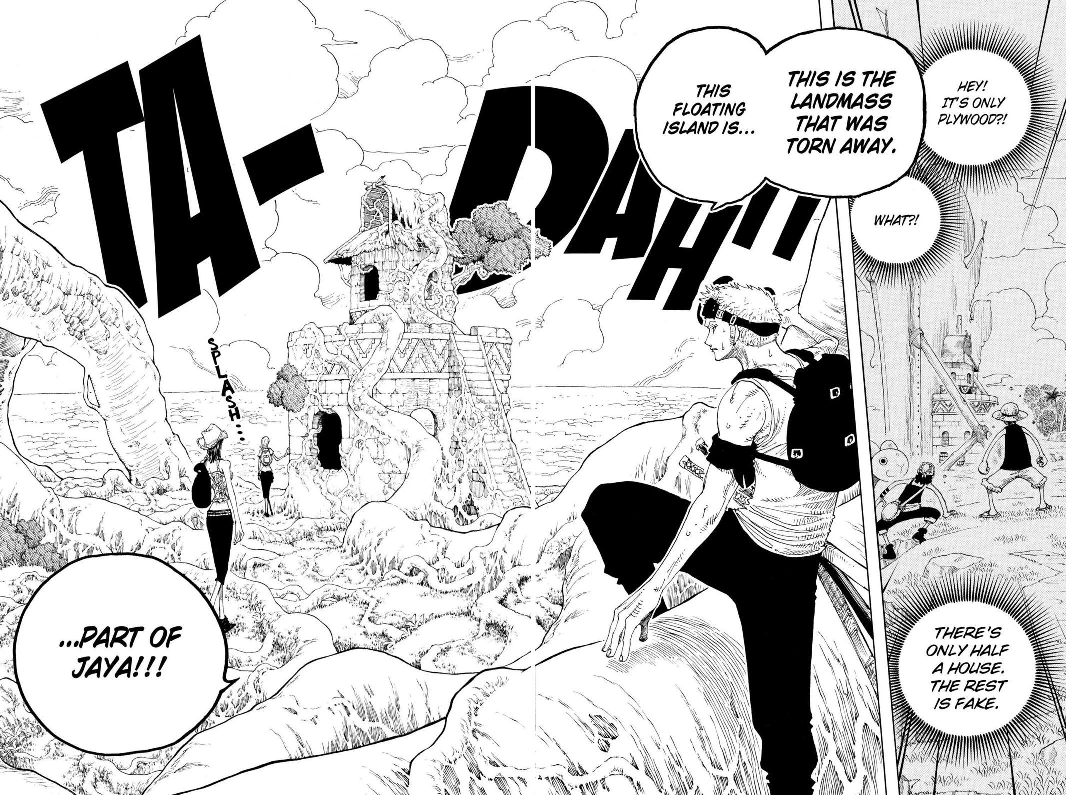
In One Piece (that's is not a series where the art is supposed to be perfect) You are not supposed to see amazing drawing from the foreground to the background. The background is supposed to bring more life but the subject of the panel is what is important.
Here for example:

The Giants or the population are secondary. There were therefore drawn quickly and in a sloppy manner. What is important is the iceberg and the line of lecture from Jozu to the iceberg.
Things have not changed since then. Oda started to adapt his drawing technique to his support already back then.
What of the most important aspect of One Piece is and will ALWAYS be the line of lecture.
This is a reason why One Piece, despite the sloppy characters in the background, is still on top.
In a manga, readability is key. The average reader will only stop on a panel for a few second on a panel. So If your drawing looks cool but isn't readable, you will lose 90 % of your readers instantly.
That's why the trial of bad drawing in One Piece is a very bad one. One Piece still has amazing drawings.
Thats one of saddest things of current OP.
It's so rare to have those cool double pages where u could feel the "vibe" of the moment, now everyhting need to have random characters reactions and comments on everything or the reader forget about the thousand of characeters that Oda put into the arc.
To me, since Wano that the things have gonne tottally bad, but u could arge that since the TS its becoming more and more simpler, expecially regarding characters moving, while the panelling and speech bubbles become more and more packed.
WCI was already not peak, but it had still that great feel and the paneling was good, for the most of it, but Dressrosa, Wano and Egghead were tottally shit.
I dont really mind Nika having all this carton things, but would be even better with the old art makng it really fell different.
A thing i belive have also affected the change, besides Oda making it simpler to draw more with less effort, is the change from fisical to digital drawing. If I'm right it was in Dressrosa that he started to draw only on tablets, so all the weight of the ink, pencil and the "tradicional" style was lost to this digital way
Never forget how those stories are supposed to be read to begin with.
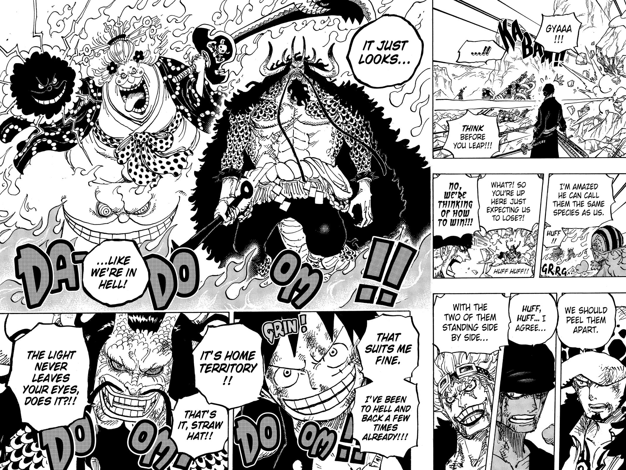
While I definitely agree that physical is the preferred way to read this series, I think it's important to stress that not even Oda takes into consideration volume releases sometimes. Take this page for example. Kaido stands smack dab in the middle of the page, where the spine of the volume would be, completely obscuring him. Oda tends to these kinds of spreads a lot by the way.
I also want to say that I actually like Oda's art and art style on their own. What I dislike is Oda's prioritization of certain things in the manga. The way he tries to cramp as much information as possible into a single page. His art would get significantly more time to shine if he prioritized large panels with fewer characters inside of them.
While I definitely agree that physical is the preferred way to read this series, I think it's important to stress that not even Oda takes into consideration volume releases sometimes
Those kind of double page don't change that imperative.
The way he tries to cramp as much information as possible into a single page.
But what people needs to realize is that this type of paneling is not new, and I mean not new at all, it predates even Thriller Bark. (I would say that Oda started to do that around the end of Skypiea. In reality it was a progressive evolution)
What we need to understand also, is that "more space" comes also with a cost : Pacing.
The first part of grand line was very innocent, so leaving more room to breeze was logical. But with the story tensing up and the amount of work Oda had in front of him, there were most probably choices to be made.
We cannot afford to take 3 or 4 pages to describe a simple duel, 1 panel is enough. Yes, its less "impactfull", but we gain more in other domain (mostly in term of narration).
You ALSO need to consider this : the lines of the final product are cleaner and the dark in the impression are soften. Which result is less apparant density on the page. So reading the scan can be overwhelming sometime because its highly contrasted.
But I do agree and regret the fact that Oda do not create more spaces in panels or let entire double spreads breeze with no added panels.
You are not supposed to see amazing drawing from the foreground to the background. The background is supposed to bring more life but the subject of the panel is what is important.
This is a reason why One Piece, despite the sloppy characters in the background, is still on top.
In a manga, readability is key. The average reader will only stop on a panel for a few second on a panel.
In a manga, readability is key. The average reader will only stop on a panel for a few second on a panel.
the change from fisical to digital drawing. If I'm right it was in Dressrosa that he started to draw only on tablets, so all the weight of the ink, pencil and the "tradicional" style was lost to this digital way