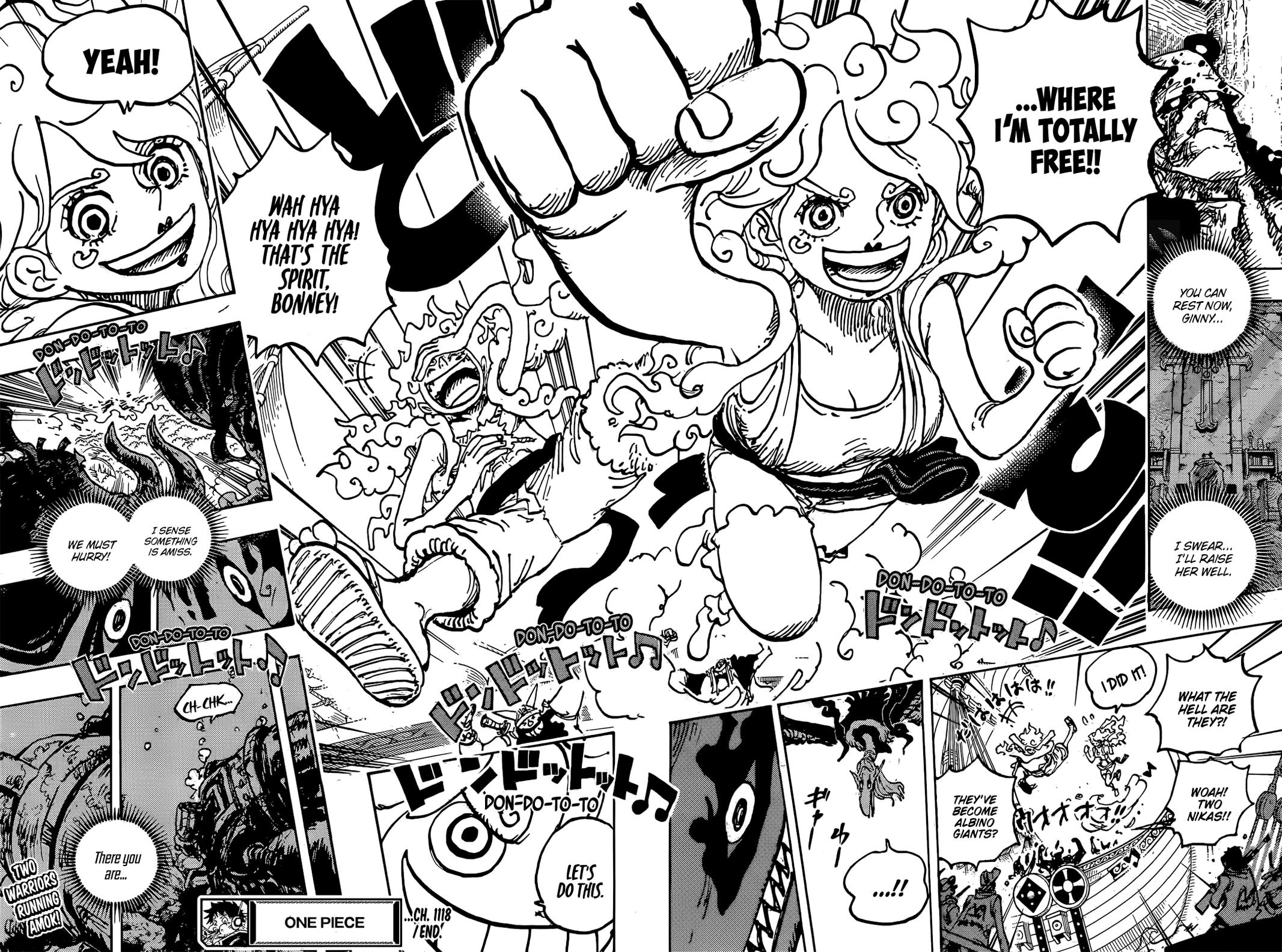
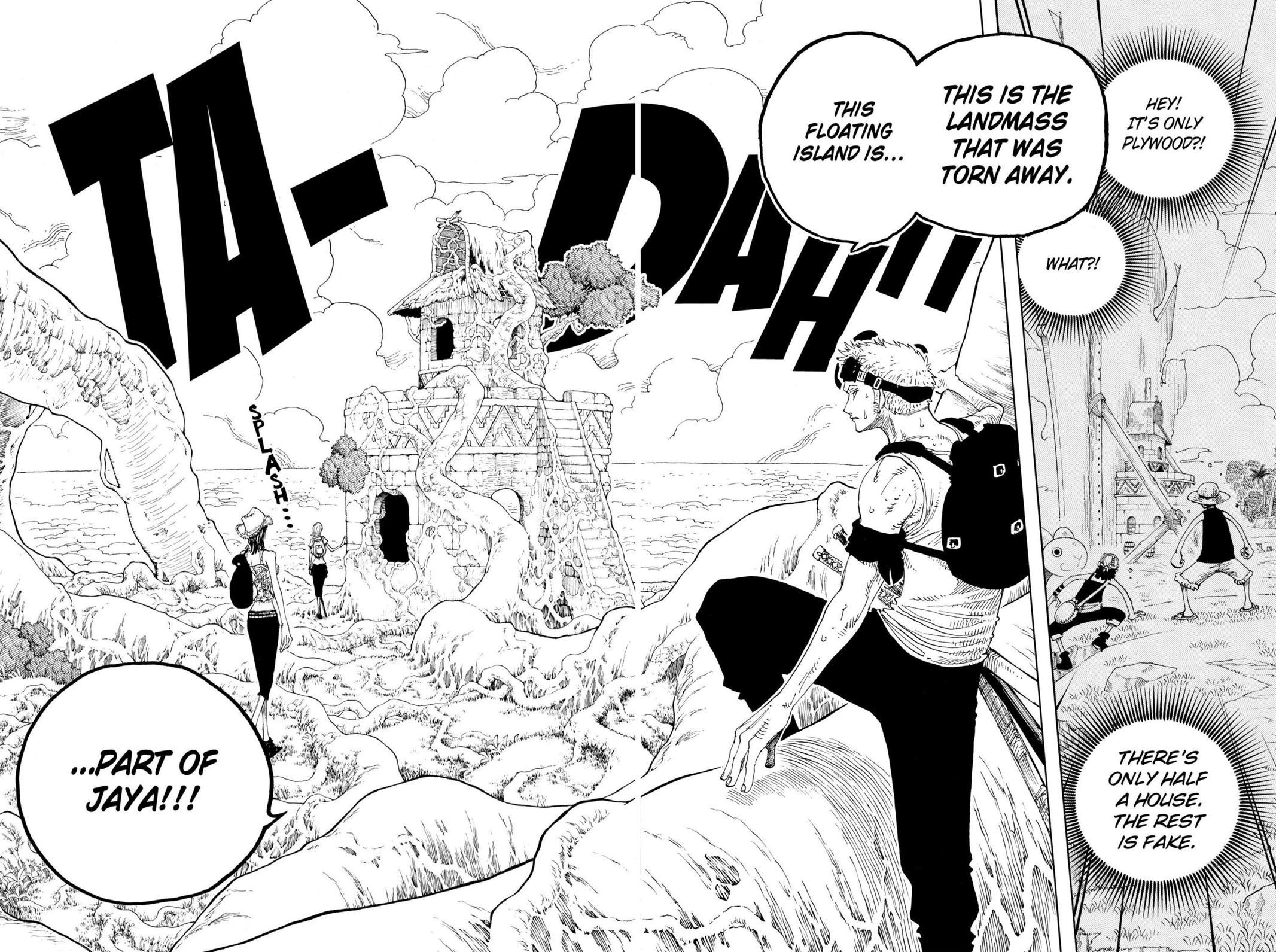
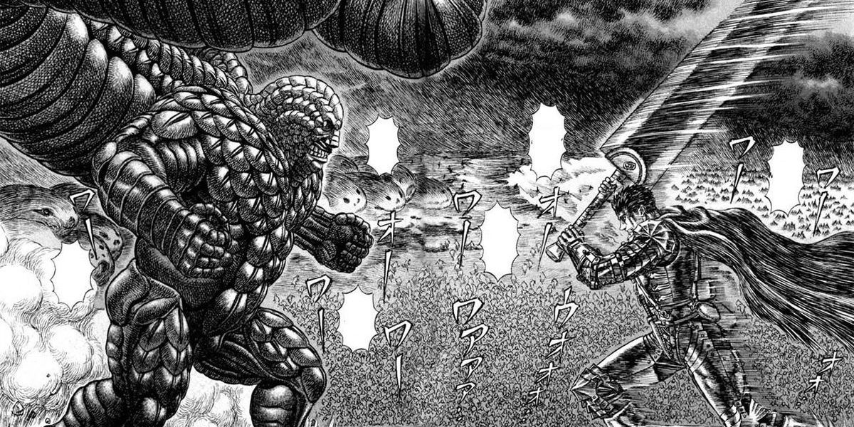
It's way too cluttered and even when not, it's kinda hard to tell what's happening on panel sometimes. It's been especially bad since the Gorosei showed up.
The style with clean and simple lines pre skip was better imo than whatever has been happening lately too. Everything seems more... round idk how to explain it.
The style with clean and simple lines pre skip was better imo than whatever has been happening lately too. Everything seems more... round idk how to explain it.
imo
