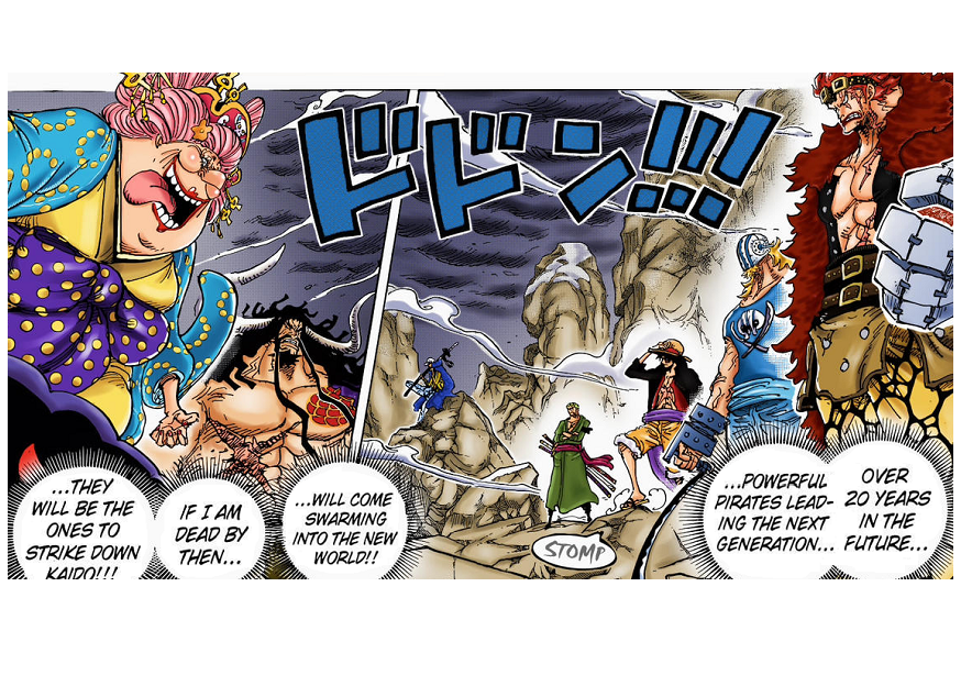
One Piece Episode 1015 - Straw Hat Luffy - The Man Who Will Become the Pirate King

Rate The Episode

  • 5/5

    Votes: 155 88.1%
  • 4/5

    Votes: 9 5.1%
  • 3/5

    Votes: 3 1.7%
  • 2/5

    Votes: 6 3.4%
  • 1/5

    Votes: 0 0.0%
  • 0/5

    Votes: 3 1.7%

  • Total voters
    176
The animation looks insane. I really like what the anime is doing with one piece. Maybe I'll watch it some time, perhaps they'll do a better job than what Oda has been doing.
Post automatically merged:

I feel like Oda just fails to capture the story with his art. Like don't get me wrong, Oda's a great artist, but...

This is a giant war and a lot of times it feels like we are barely seeing this. Miura drew these amazing war scenes and while I by all means don't expect the same art quality from Oda, showing things in the big picture would really help.

Also, in regards to perspective, I feel like Oda is forced to compromise a lot. Like with big mom, I remember there were a ton of scenes where her size was all over the place.
 
It is not the best chapter of the series as many are saying...it's good because it hypes you! And in next episode Kaido is gonna bully them don't forget that!
 
So I haven't watched the anime since Punk Hazard. I occasionally watch a few clips here and there if it has great animation because I am a fan of animation, but this episode had crap animation background! They continue to ruin great animation with these stupid flashy unnecessary colors that ruin the actual animation. Like why? Why is it so hard just to animate Luffy punching Kaido without all those flashy background?
 
So I haven't watched the anime since Punk Hazard. I occasionally watch a few clips here and there if it has great animation because I am a fan of animation, but this episode had crap animation background! They continue to ruin great animation with these stupid flashy unnecessary colors that ruin the actual animation. Like why? Why is it so hard just to animate Luffy punching Kaido without all those flashy background?
It was good.

Thats just called "effects work". And there wasn't even much of it when Luffy punched Kaido. The auras that people were complaining about appeared for literally one second. The rest was just the "natural" effects associated with punching Kaido in the face with a giant flaming fist.
 
So I haven't watched the anime since Punk Hazard. I occasionally watch a few clips here and there if it has great animation because I am a fan of animation, but this episode had crap animation background! They continue to ruin great animation with these stupid flashy unnecessary colors that ruin the actual animation. Like why? Why is it so hard just to animate Luffy punching Kaido without all those flashy background?
The same reason it hard for you to go away form one piece :kayneshrug:
 
It was good.

Thats just called "effects work". And there wasn't even much of it when Luffy punched Kaido. The auras that people were complaining about appeared for literally one second. The rest was just the "natural" effects associated with punching Kaido in the face with a giant flaming fist.
Stop it. Those effect works took up the whole segment.

Look at here when Luffy first transformed in G4 and tell me if you see any of those unnecessary "effect works".


Or here:


There are none which is why these were directed much better than the recent episode. Not sure why anyone would want to see a bunch of pretty colors taking over the actual punch. It adds nothing.
Post automatically merged:

The same reason it hard for you to go away form one piece :kayneshrug:
Dude, if you aren't going to reply back with a legitimate comment then please f off. Go outside and get some fresh air instead of wasting your time on here. I am here to discuss. I am not here to read your lame one liners.
 
Last edited:
Stop it. Those effect works took up the whole segment.

Look at here when Luffy first transformed in G4 and tell me if you see any of those unnecessary "effect works".


Or here:


There are none which is why these were directed much better than the recent episode. Not sure why anyone would want to see a bunch of pretty colors taking over the actual punch. It adds nothing.
Yeah, because more technical effort was put into that scene than the scenes you linked. Its got more effects going for it because its supposed to be a "flashier" scene, and it absolutely benefits for it.

And the Red Roc from the latest episode absolutely was better directed than the scenes you linked. It has just a generally far better attention to detail when it comes to things like lighting and atmosphere and colour design, which makes it come together far better than the fairly sterile looking scenes you linked above.

For example, the flames in the gear 4th clip do not actually have any effect on the lighting at all.
 
Last edited:
Yeah, because more technical effort was put into that scene than the scenes you linked. Its got more effects going for it because its supposed to be a "flashier" scene, and it absolutely benefits for it.
And this is exactly why I hate it, because it does have those unnecessary flashier scenes. We don't even see the punch connect, all we see are a bunch of flashy lights. I don't know about you, but I prefer seeing the punch rather than some pretty lights.

And the Red Roc from the latest episode absolutely was better directed than the scenes you linked. It has just a generally far better attention to detail when it comes to things like lighting and atmosphere and colour design, which makes it come together far better than the fairly sterile looking scenes you linked above.

For example, the flames in the gear 4th clip do not actually have any effect on the lighting at all.
Adding flashy scenes does not mean it is directed better. What makes a scene better directed is to actually see the actual punch land which we didn't get to see. I agree that the animation was better however the flashy scenes ruins the whole segment.
 
Top